
SideUpBrandbook

How SideUp looks, sounds and behaves

The rules behind our logo, colours, type, photos and voice, so everything we make feels like one company. Written for our team, our partners and anyone building with us.

The brand in one paragraph

Warm, precise and a little playful

SideUp turns employee benefits into money people can actually spend. The brand reads as warm, precise and a little playful: a confident purple, a lime that marks the moment something good happens, plenty of white space, soft rounded shapes, real people, and one white cat.

Purple carries identity

Our main colour is for primary fills, the logo and large display words.

Lime carries reward

It marks the moment something good happens: a highlight, a success chip, the card, the accent button.

Dark grey frames the product

Dark bands, the footer and the product frame use our charcoal. Everything else breathes in white.

The rebrand story

Dressed for 2026

We rebuilt the identity around two goals: a look that matches our culture and core values, and a brand position that fits the vibes of the two markets we serve.

Who is SideUp?

ModernInnovativeDiverseCheerfulPushyDriven

Who is our customer?

We looked at what people in each market already love. In both, it is sport: big moments, team colours, stadium light.

United Kingdom

46 million

UK adults (86%) identify as football fans

18 million (33%) identify as tennis fans, and 17 million (32%) as rugby fans.

United States

188 million

US adults (73%) identify as NFL fans

119 million (46%) identify as NBA fans, and 52 million (21%) as tennis fans.

Source: Statista, as cited in the 2026 rebrand deck.

What the colours had to say

UK: all about purple

Purple is not only safe. It is familiar and expected, and everything else gravitates around it.

US: vibrant and explosive

Lots of light and chroma. Loud colours spiced with purple, orange, yellow, pink and blue.

The result is one palette for both markets. Purple is the anchor, lime marks the reward, charcoal and warm light keep it balanced, and a set of loud support colours adds the US energy in small doses.

Do

  • Bet on dark and light pastel tones. They balance the core colours
  • Pair purple with light tones and pastels
  • Put lime on dark tones, where it has strong contrast
  • Use large off-white areas to breathe and to build longer content
  • Alternate with dark spaces for narrative accent moments

Don’t

  • Use lime on white or other light tones. It is not legible
  • Stack neon on neon, or cover large areas with neon
  • Forget that neon colours are for brand accents
Colour

A confident purple and a lime that rewards

Identity colours never shift. Do not lighten the purple for dark sections: change the surface instead.

#A84EF7

Main purple

Primary fills, large display accents, the logo, the focus ring.

#98FF14

Accent lime

Reward moments: highlights, success chips, the card, the accent button.

#2E303A

Dark

Dark bands, the footer and the product frame.

#EFEEE8

Light

Warm neutral bands and illustration backdrops.

Text and lines

#151515 body text#525764 secondary text#BBBEC6 dividers#F2EFFD text on dark

Support colours

For illustration, charts and category accents. Never a second brand colour, never for buttons.

#FF5C30#EF3685#FFC700#007CC4#1A6363#00A9BC

Contrast rules

  • White on purple: large text only (24px, or 18.66px bold)
  • Purple on white: large text only. Small purple text uses the darker purple #543769
  • Black on lime: everywhere (16.65 to 1)
  • Lime on dark: text and icons (10.41 to 1)
  • Lime never goes on white as text

Section bands

  • White: most sections
  • Soft grey #F9F9F9: feature grids and FAQs
  • Warm #EFEEE8: testimonials and “how it works”
  • Purple: one statement or one stat, with a lime button
  • Dark #2E303A with the dot grid: product showcase and final call to action
  • At most one dark band and one purple band per page
Typography

Two families, no others

Cabin for headlines, eyebrows and big numbers. Elms Sans for everything else: body, interface, buttons, forms and captions. Fallback: system sans-serif.

Aa

Cabin

H1 to H4 and eyebrows. Weight 700 for display, 500 for H4.

Aa

Elms Sans

Body, buttons, forms and captions. Weights 400, 500 and 700.

RoleDesktopMobileWeight
Display (hero H1)44px Cabin32px700
H2 section title36px Cabin28px700
H3 card title24px Cabin20px700
Lead20px Elms Sans16px400
Body16px Elms Sans16px400
Caption14px Elms Sans14px400 to 500
Eyebrow12px Cabin, uppercase, 0.1em tracking12px700
Button16px Elms Sans16px700

Rules of thumb

  • Body copy never goes below 16px
  • One highlighted phrase per headline, set in purple, the rest in dark grey
  • One capitalisation convention per page
Buttons and components

Soft, rounded and easy to tap

Every button, chip, badge, eyebrow and avatar is a pill. Square-cornered buttons break the spec.

Buttons

  • Primary (purple, white text): the main call to action on white bands
  • Accent (lime, black text): the call to action on purple and dark bands, and reward actions
  • Secondary and Outline: second and third-level actions
  • Elms Sans 700, sentence or Title Case, never all caps. Large size is 52px tall, minimum tap target 44px
  • At most two buttons in a group

Eyebrow and chips

Eyebrow

FlexibleWellnessSuccess

Chips are pills with an optional coloured dot. Never use colour as the only signal.

Shapes

  • 32px: section cards, testimonial cards, framed product shots
  • 16px: inner cards, tiles, images inside cards
  • 8px: inputs inside forms
  • Pill: buttons, chips, badges, avatars
  • Nested shapes step down one level

Category colours

Each benefit category has a dot colour. Use it for the chip, icon tile or page accent.

RecognitionFlexible and EducationEntertainmentEssentialHealthMealTransportTravelWellness
Imagery and the cat

Real people, social-style frames, one white cat

People

Real, diverse employees in candid, happy moments. Frame them in portrait, 4:5, on a purple tile with 32px corners, with a small floating chip or a heart, the way you would see them in a social post. No stock-office handshakes, and no people without the tile treatment.

Wellbeing
Family

The cat

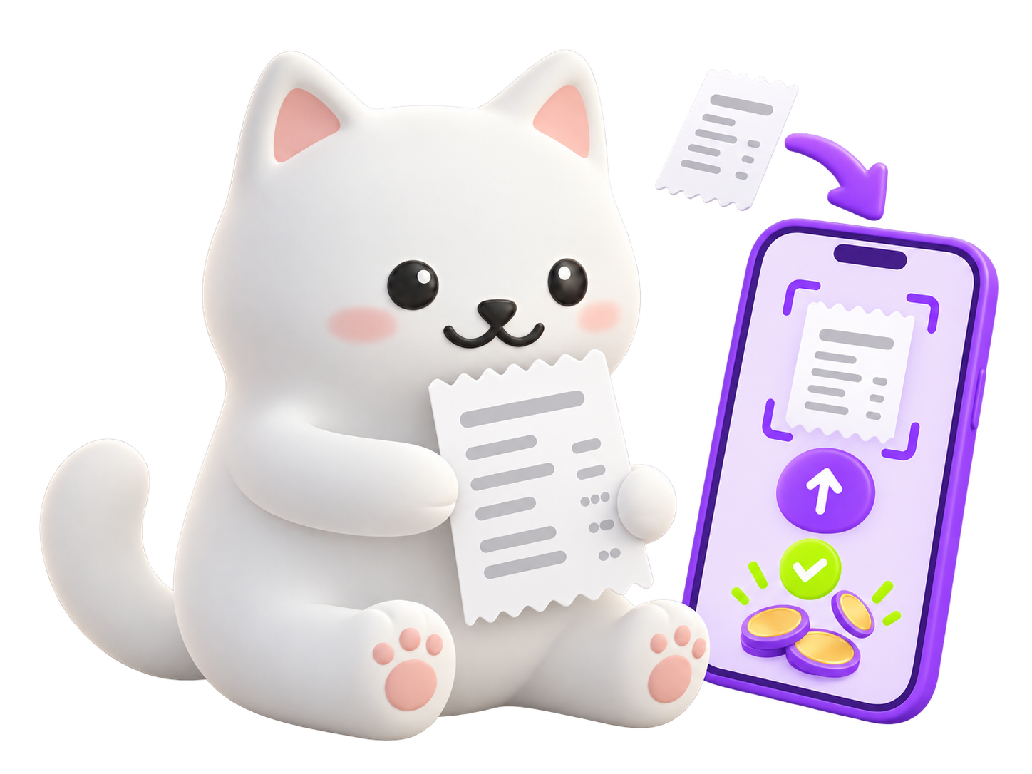
A soft 3D white cat with pink cheeks and paws is our mascot. Use it for empty, error, 404 and celebratory moments, at most once per page. When it appears with money, it holds the lime SideUp card.

The SideUp cat holding a receipt next to a phone

The card

The lime SideUp card is the physical proof of benefits as spendable money. Show it on the purchase and reward story.

Floating UI

Overlay real product fragments on photos: a category chip, or a balance card with an exact figure. Label mock figures as illustrative.

Gradients and icons

An orange to purple blob may sit behind the cat or a hero visual, never on text, buttons or the logo. Icons are Material Symbols Outlined, 20 to 24px.

Voice

Warm with people, exact with money

We talk to employers about results and to employees about their own money, with real numbers in both cases. Confident, never boastful. Friendly, never cute.

The ten requirements

  1. Lead with a real number when one exists, not an adjective.
  2. Talk to the buyer as “you” and “your team”. Give employees a voice through named people with a role and a detail.
  3. Headline = problem, then SideUp, in one line.
  4. CTAs name the next step or its cost.
  5. Use plain product terms consistently: benefit, allowance, enrolment, the SideUp card. Do not invent synonyms.
  6. No stacked adjectives without a number or a mechanism nearby.
  7. Stories are specific: name, role, workplace type, amount.
  8. Be friendly to the end user. Explain any financial or legal term in plain words. Benefits and tax make people anxious, so the copy should calm.
  9. Be diligent with money, dates and deadlines. Exact figures, currency and period.
  10. Be responsible. Never promise an outcome or give unqualified financial, legal or tax advice. This is the most serious rule: copy that breaks it does not ship.

Headline formula

“Your best people are leaving for better benefits. Keep them for the same budget.”

Region

UK pages use UK spelling and pounds. US pages use US spelling and dollars. Never mix them on one page or in one deck.

Buttons and links

WriteNot
Book a 15-min demoLearn more
See the benefits catalogueKnow more, Read more
Get the guide (PDF, 6 pages)Click here
Talk to our teamSubmit
Compare plans for 50+ employeesFind out more

Before and after

BeforeAfter
Revolutionary benefits that everyone loves[X of Y] employees used their allowance in the first month. [source, year]
Employees say SideUp is great“I put £1,140 toward childcare last year.” Priya, nurse, Leeds. (Example)
Save money with tax-free benefits!Pay for some benefits from gross salary. How much you save depends on your tax band.
Around £500 left£486.20 left until 31 December

Money, tax and eligibility

  • Write “Your £100 monthly wellbeing allowance renews on 1 November,” not “around £100 a month”
  • Explain each tax term in one plain sentence, and add a line such as “How this applies to you depends on your salary and tax band”
  • Never write “saves everyone money” or “tax-free” without the condition
  • Every statistic carries its source and year. No source, no stat

People in examples

  • Use fictional people, marked “example” where they could be mistaken for real, or people who approved their story
  • Never use real, unconsented individuals

Edit out the AI-sounding patterns

  • Em dashes as the hinge of a sentence, and “it’s not X, it’s Y”
  • Clusters of hype words (seamless, unlock, empower, elevate, game-changing) without a number behind them
  • Runs of same-length sentences, lists of exactly three, and breathless “and… and… and” sentences
  • Stock openers and closers (“In today’s fast-paced world”), uncited “studies show”, and rhetorical questions used as a habit
  • Emoji and exclamation marks in body copy
Need something else?

Questions about the brand?

Email our team for logos in other formats, partner co-branding or anything this page does not cover.

Talk to our team